Earlier this year, I had the privilege to work on the title sequence for OFFF Barcelona 2018. Trusted with the animation of the typography, I worked with a team of artists to create 61 titles with the look and feel that matched the concept of Gemini.
The concept statement for Gemini being:
"The concept combines Marshall McLuhan’s famous quote “The medium is the message” with a modern take on the Greek myth of Gemini. The twins risk everything to be together even if it cost their lives; They are one entity as if a medium and the message can’t be separable. The fate of one eternally tethered to the other in a divine purpose: perpetuating creativity, ingenuity, and mass human connection.
The sequence explores the development of human ingenuity and communication through media (letterpress, broadcast, and internet/AI) juxtaposed with the story of Gemini (Their birth, sisterhood, and death/rebirth)."
Exploration for the type began with research into earlier languages and how they evolved. That being the first idea - the type would evolve as it animated. Lines were also included to indicate that the pieces of letterforms are being pulled together by a loom - referring back to the beginning of the piece with one of the sisters on the loom.
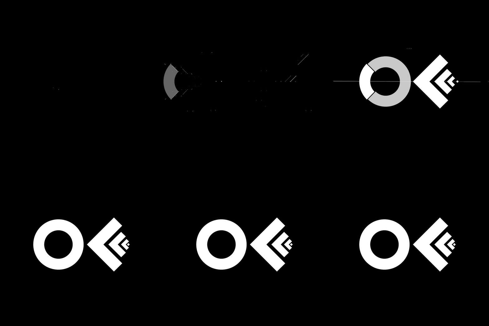
After reviewing with Creative Direction later, it was decided that - while tied to the creative vision - evolving letters may distract from the impact of the animation itself. Further iterations were completed until we landed at something that was interesting to watch while supporting the dominant imagery. Below are a few of the iterations as the type developed over the course of the project:
I was also lucky enough to go on set for the shoot as well. It was inspiring to meet so many other talented folks, I grabbed some behind-the-scenes shots while I was there.


